
Unixdev Website Redesign
Figma
June - July 2024 (8 weeks)
Brand book (Guidelines)
Design system with design tokens
High-fidelity prototype & mockup
Responsive website
Internship at Unixdev Co., Ltd.
Role
UX/UI Designer
Deliverables
Project type
Duration
Tools
A responsive website for desktop and mobile platforms
2024
OVERVIEW
Introduction
“Empowering Businesses Through Technology”
“To be a Leading Technology Partner Driving Sustainable Innovation”
Unixdev’s Mission and Vision
Unixdev, a technology service provider specializing in large-scale web infrastructure and high-performance operations. Unixdev develops customized technical solutions that enhance operational capabilities, accelerate product launches, and improve end-user experiences.
As part of my UX/UI design internship at Unixdev, I was assigned to redesign the company’s website for both desktop and mobile platforms. The project focused on enhancing the website’s visual appeal and usability while reflecting the company’s branding.
The Process
Project Objectives
The project began with a kickoff meeting with stakeholders including the Managing Director and my UX/UI team lead to receive the brief and align on objectives.
The company’s primary brand color is green; ensure it’s applied consistently across the design
The Managing Director prefers a futuristic aesthetic: incorporate sleek elements and modern typography
Create a visually striking hero banner that immediately captures attention with clear hierarchy and a strong focal point
Design the website for both desktop and mobile platforms to ensure a responsive experience across devices
RESEARCH
Competitive Analysis
As part of my research, I analyzed competitors to identify their strengths and weaknesses. Potential solutions I developed include:
Establish a clear typographic hierarchy using size, weight, and color to differentiate headings and body text
Use consistent visual weight and spacing to guide users’ eyes through the content in order of importance
Adopt modern design trends (clean layouts and minimalist approach)
Replace animations with smooth and purposeful micro-interactions to enhance user flow
The Problem
Through initial assessment of the current website, design challenges became apparent. These flaws were noted and taken into account for future design decisions.
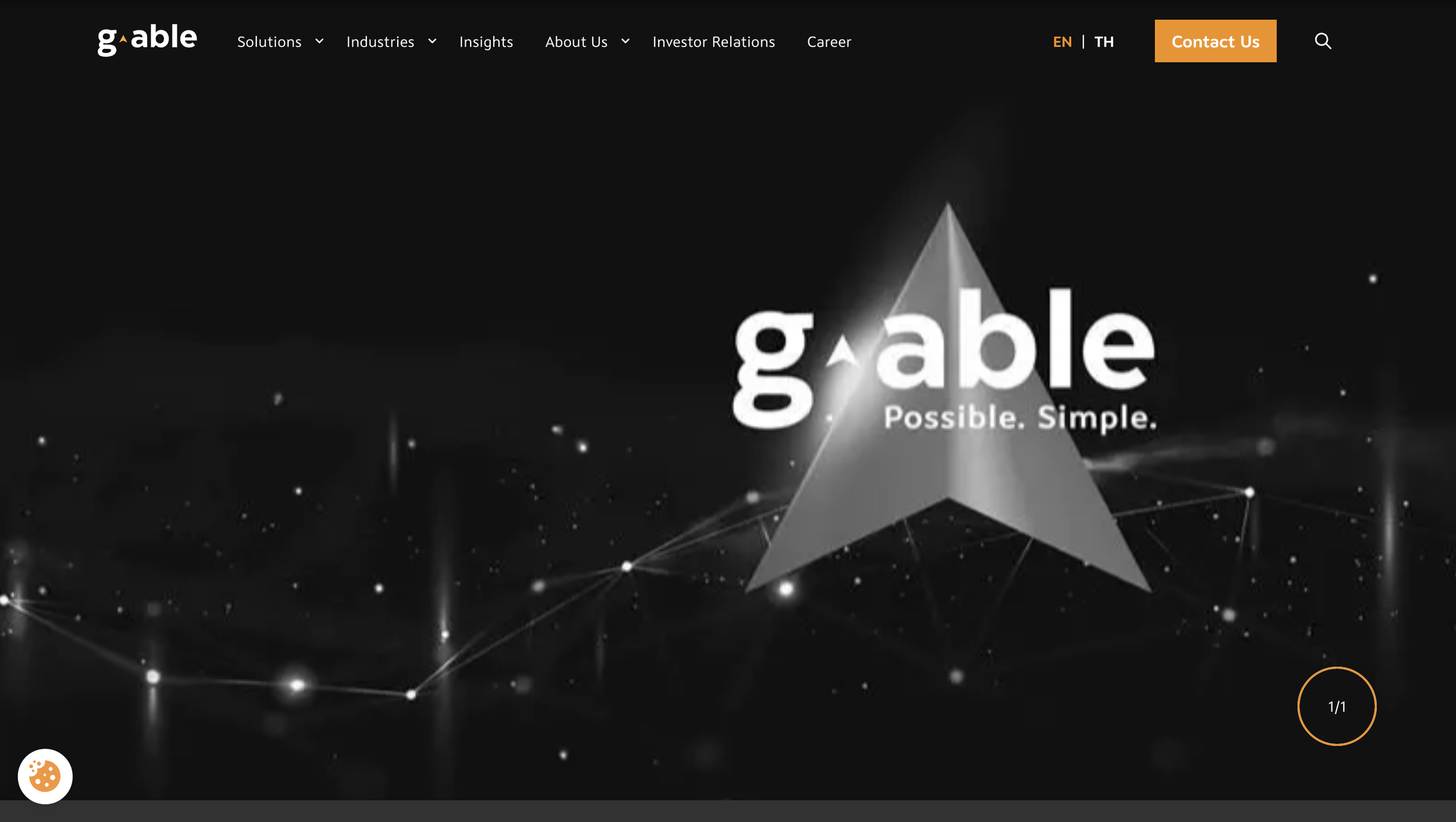
G-Able
Cluttered with sections, making it hard for users to scan. The hero banner’s image lacks visual impact and uses a distracting zoom-in animation on page load.

Manao Software
Minimal, intuitive, and responsive. Color palette and visual hierarchy align with the brand. However, typography is inconsistent and weakens professionalism.
❌ Lack of visual hierarchy
—>
—>
❌ Non-responsive
❌ Outdated visual design and transitions
—>
The user interface does not automatically resize and adapt to different screen sizes or devices, resulting in a poor user experience that forces users to navigate on a website with misaligned content. This leads to a high bounce rate and loss of engagement.
The homepage used low-quality background images with overlaid text, resulting in a cluttered and unprofessional look. Also, an abrupt right-sliding transition during scrolling further disrupted the user experience with unnecessary animation.
Important content failed to stand out due to lack of emphasis, poor font pairing, and inconsistent visual weight.
DESIGN
Brand Book
After initial research, I created a brand book to guide stakeholders on the company’s visual identity. From that foundation, I derived the logo design, selected a cohesive color palette, and defined typography for the website’s user interface and overall aesthetic. Changes were made throughout the design process and these elements were the final selections.
I sketched out the overall website layout for both desktop and mobile platforms and planned the composition of where each element would live.

Then I jumped onto Figma and turned the sketches into wireframes, adding more details to the blueprint. For this part, I focused more on the detailed structure and content hierarchy, in order to test the user flow and information architecture. These wireframes were presented to my UX/UI design team leader to receive feedback.

Low-Mid Fidelity Wireframes
Firstly, I discussed with my team leader and established the layout guide for both screen sizes then named them accordingly. This guide was used consistently throughout the design process.
As part of the design system, I designed various elements such as cards, buttons etc. and their different states like Default and Hover. This prepares me in advance by establishing a clear visual change of each element when they are in different states, which makes it easier for me to design the clickable prototype.
Additionally, I created design tokens as a “single source of truth” to centralize visual styles that ensures consistency and improves the workflow between designers and developers. This makes the elements easier to scale and maintain across multiple platforms, as well as allow updates to be made in one place and automatically reflecting across the entire system.
High Fidelity Mockups
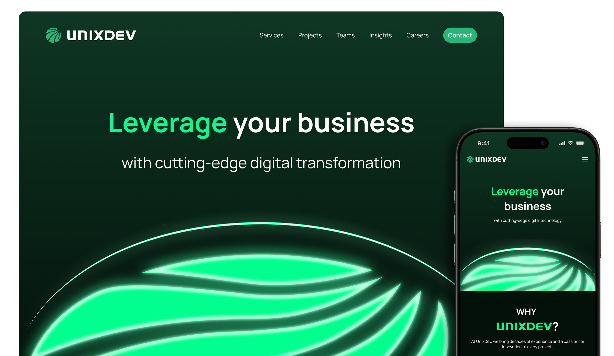
This is the application of the visual system, which is reflected in my designs for both desktop and mobile platforms. These mockups showcase the final design direction, incorporating clean visuals, improved content hierarchy, and responsive layouts.
Design System and Design Tokens
RESULTS
Interactive Prototype
To bring the designs to life, I created interactive prototypes for both desktop and mobile experiences. These prototypes demonstrate the website’s functionality, transitions, and responsive behavior across different devices. The demos showcase key user flows and interactions, allowing stakeholders to experience the redesigned website as users would.
This step was crucial in validating design decisions and ensuring the final product would meet both business objectives and user needs.
Website Demo on Desktop
Before & After
Website Demo on Mobile
The current website (left) relies on stock images for section backgrounds and lacks a striking hero banner to capture users’ attention. My design (right) adopts a minimalistic yet futuristic approach aligned with the Managing Director’s vision, and applies the color palette from the brand book established earlier to reinforce brand identity.
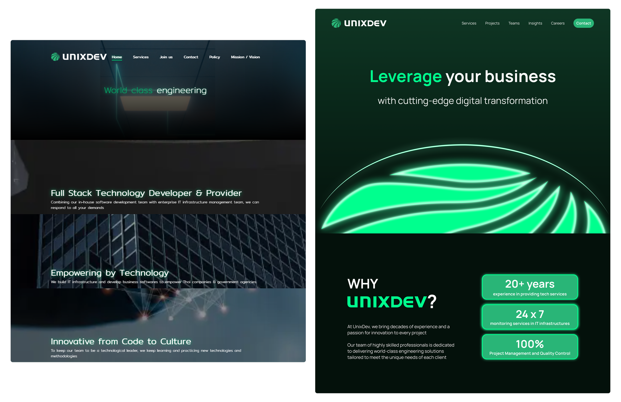
While scrolling the site you encountered a section that automatically shifted three pages to the right each time you scrolled up or down. This transition was unnecessary, so I replaced it with static cards that present the same information in a more visually appealing and intuitive way.

Before: Current website on desktop with unnecessary transitions

After: My website redesign on desktop and mobile
REFLECTION
What I would do differently..
Perform a full website audit upfront, analyzing page speed, SEO health, Core Web Vitals, and CMS performance to identify technical issues
Study user behavior through heatmaps, session recordings, and feedback tools to pinpoint exactly where users struggle and abandon the site
Document all findings in an audit report to create a data-driven foundation for the redesign
Conduct usability testing after launch to validate solutions and gather insights for continuous improvement